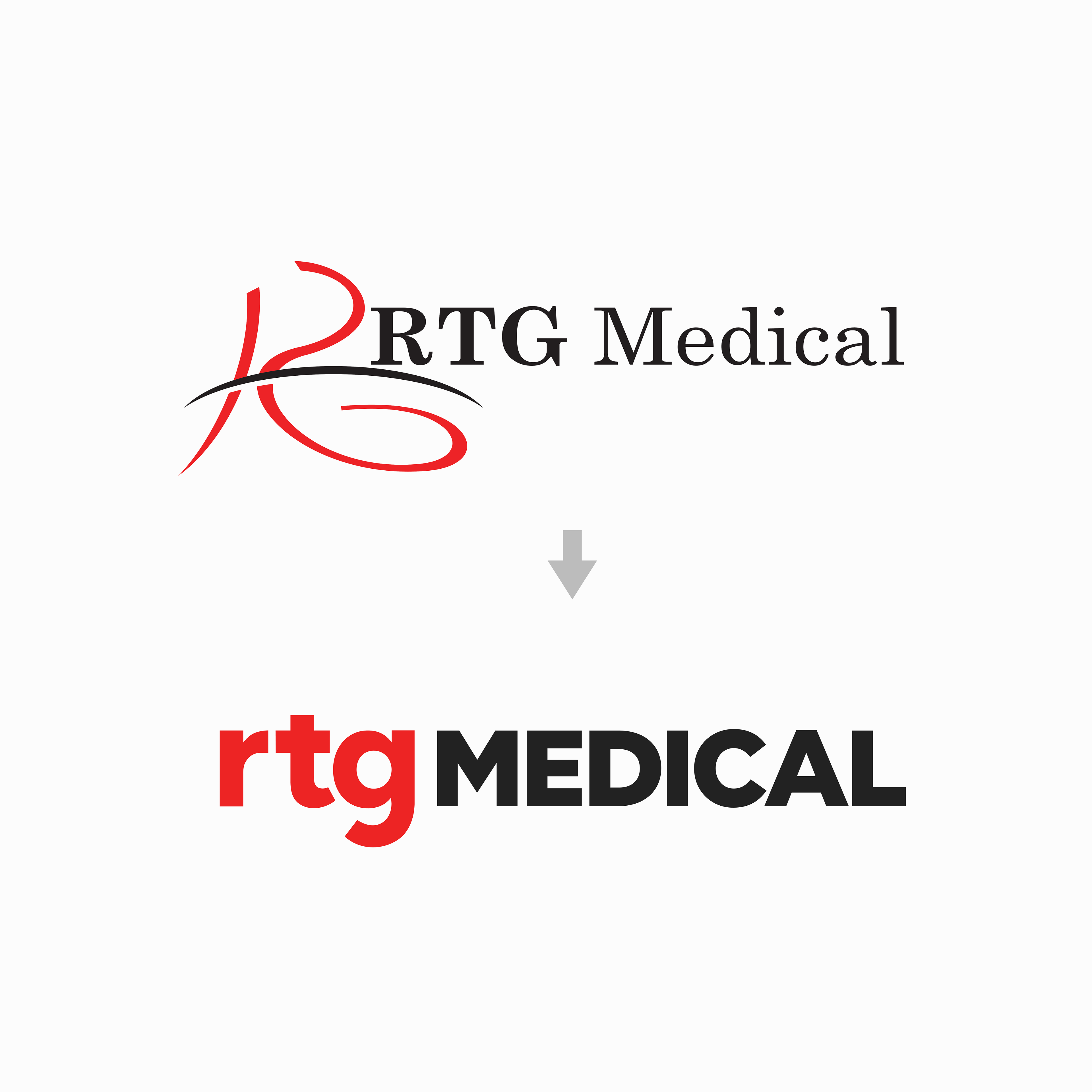
RTG Medical, a healthcare staffing agency, approached me a little over 3 years ago to begin the journey of refreshing their brand. And after all this time, through countless concepts, meetings, competitor analyses, brand positioning, employee surveys, messaging, and presentations I can finally unveil one of the larger aspects of their refresh — their NEW logo!
For the past two decades, RTG’s logo hasn’t been updated. As with many early logos, it originated from a quintessential drawing on a napkin by one by their founders. This is why we weren’t quick to pull the trigger on a new look, and why this is so special for such an established company.
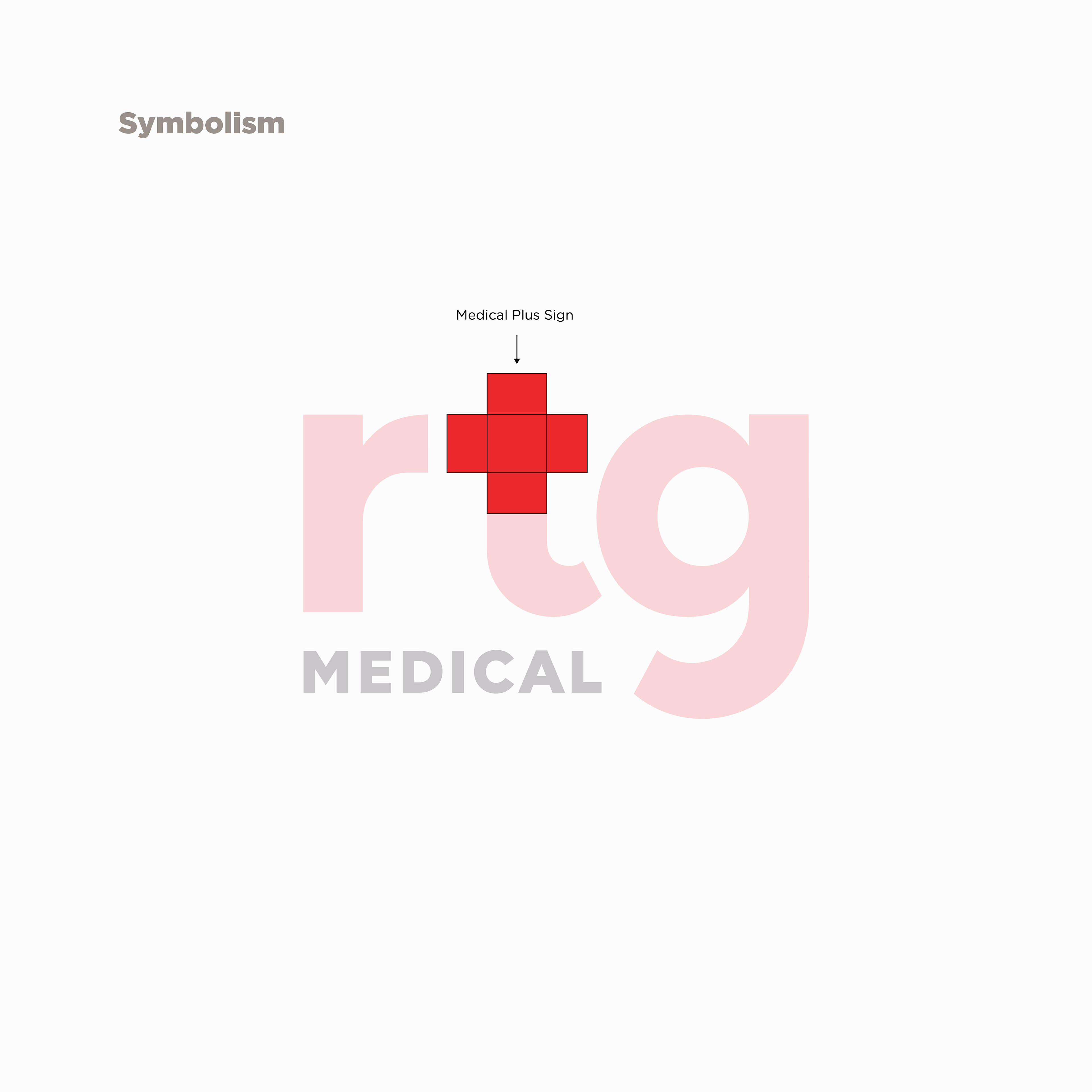
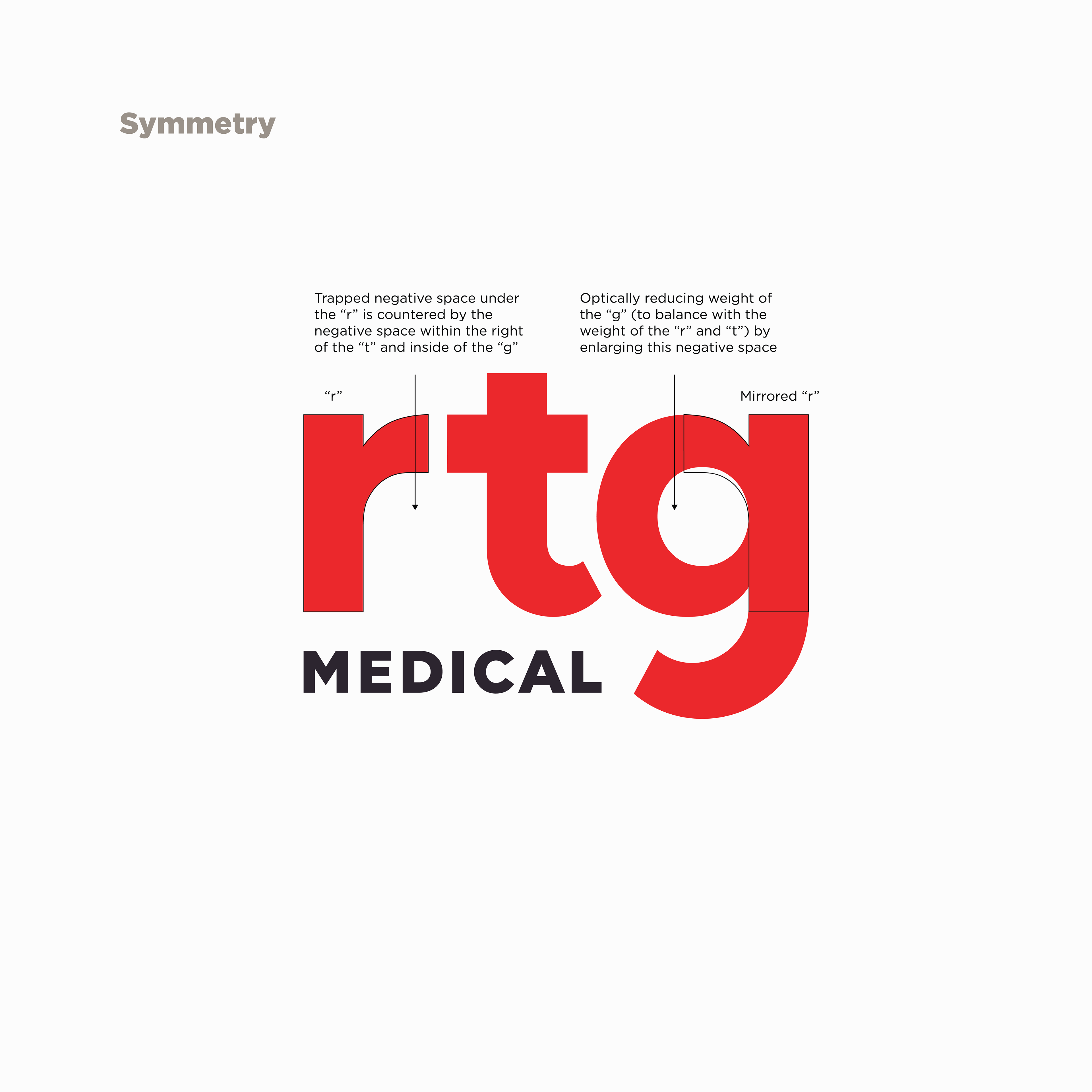
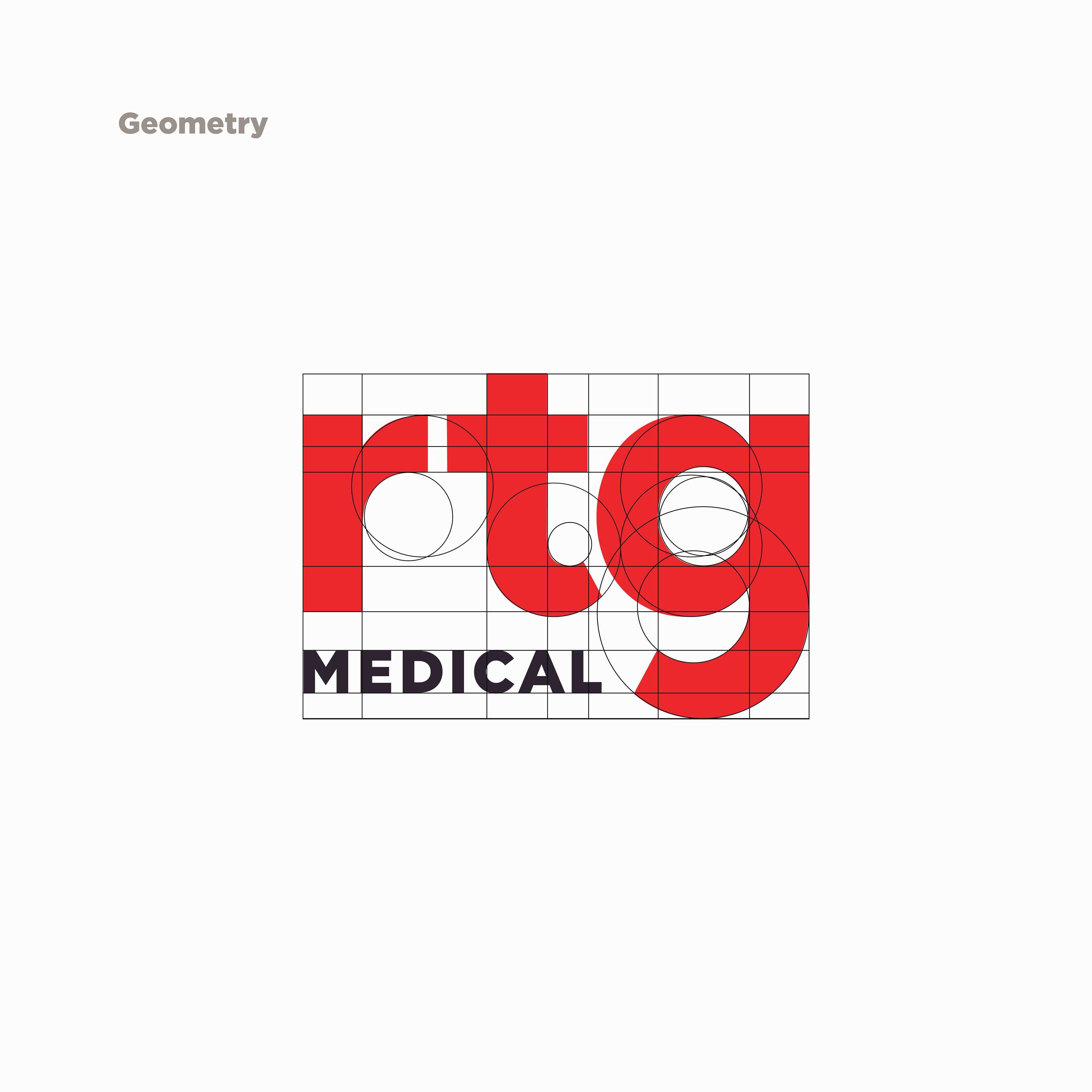
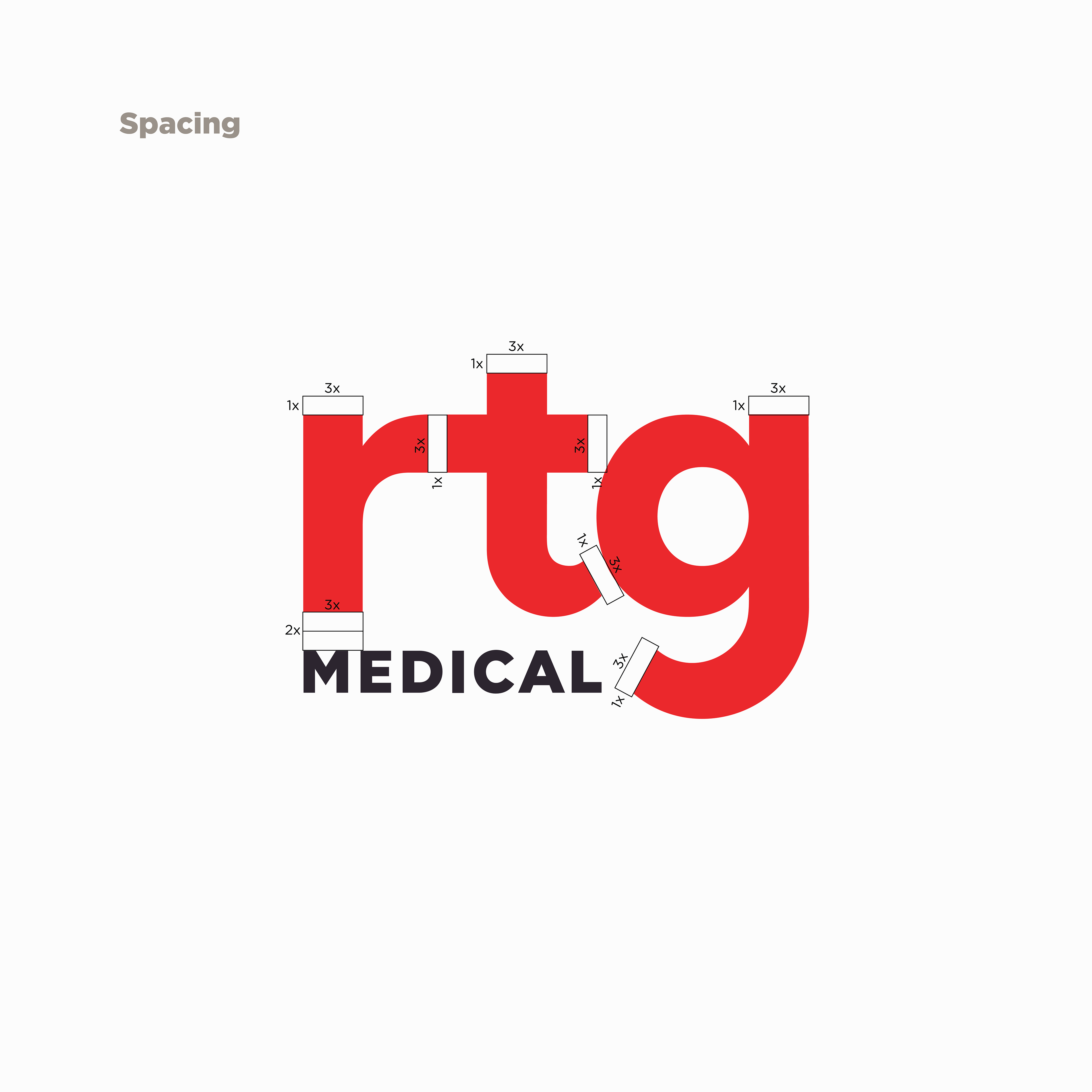
To RTG, people are their greatest asset. Helping connect hundreds of traveling medical professionals with hospitals and clinics in need of staffing around the nation. In updating their logo, I wanted to make sure to capture that humanized and friendly aspect of their company with lowercase letterforms, while also keeping a sense of nostalgia and trust with serifs. Not wanting to depart completely from their original logo, we pulled in their red (which also sets them apart from the blues/oranges/purples of their competitors). Red is also a symbolic color of healthcare in the red medical plus sign and Red Cross. At first glance, this logo may look like just a font, but it’s entirely customized and relies heavily on geometry, symmetrical balance, optical spacing, and symbolism to make it far more dynamic than its predecessor.